FONDAZIONE CRI

A CONTEMPORARY AND DISTINCTIVE BRAND IDENTITY FOR THE ITALIAN RED CROSS FOUNDATION.

logo, brand identity, website

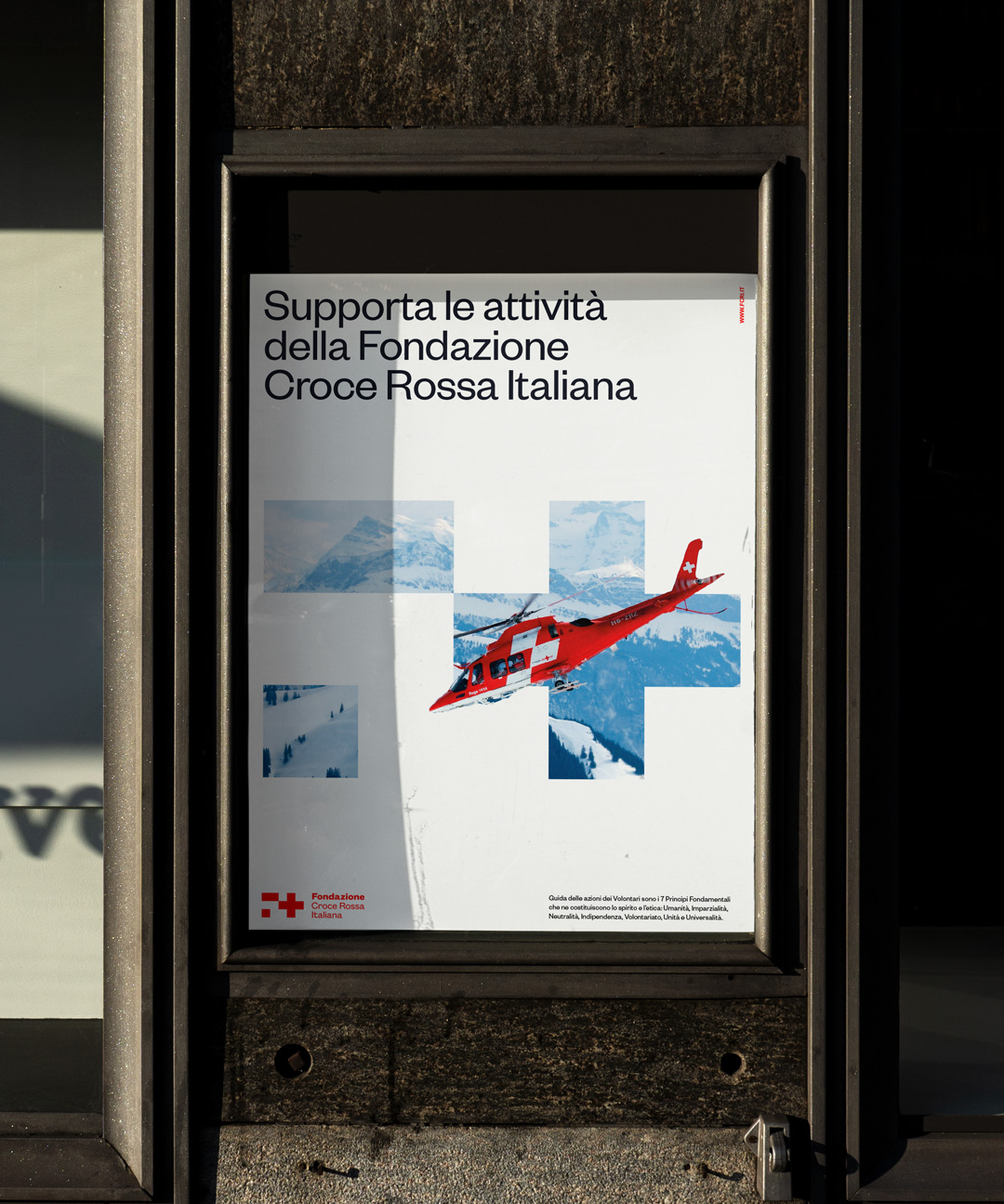
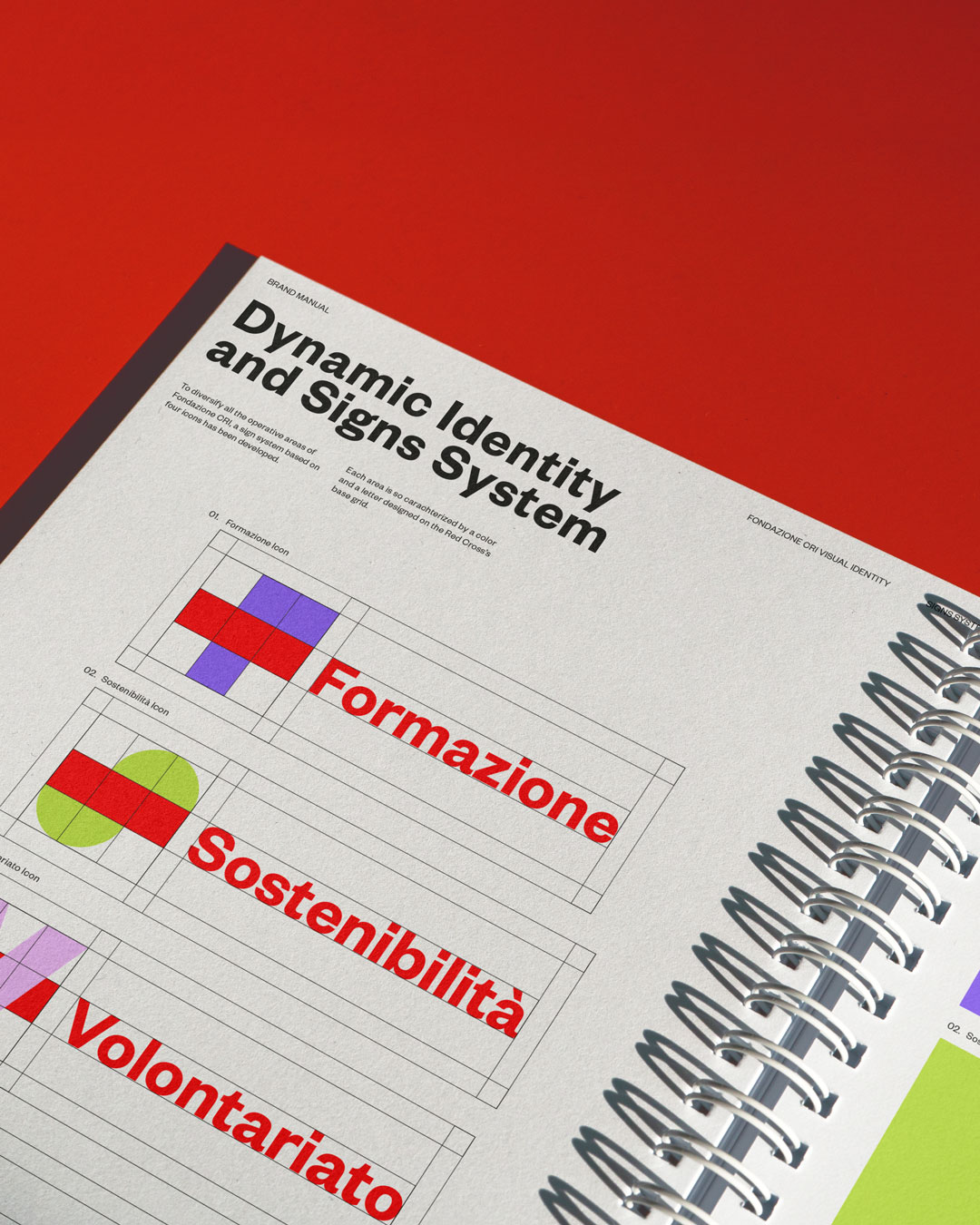
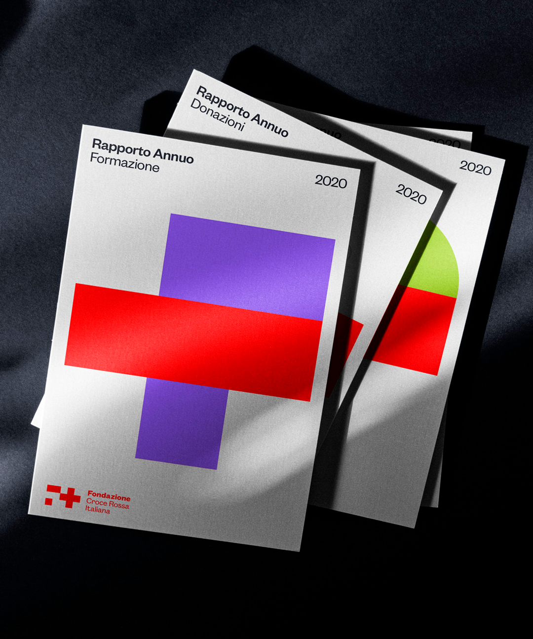
Fondazione CRI is one of the many projects developed during our long-lasting relationship with the Italian Red Cross. Based on the international symbol of the red cross, we built a brand identity that is institutional but approachable, trustworthy but smart, consistent but flexible.

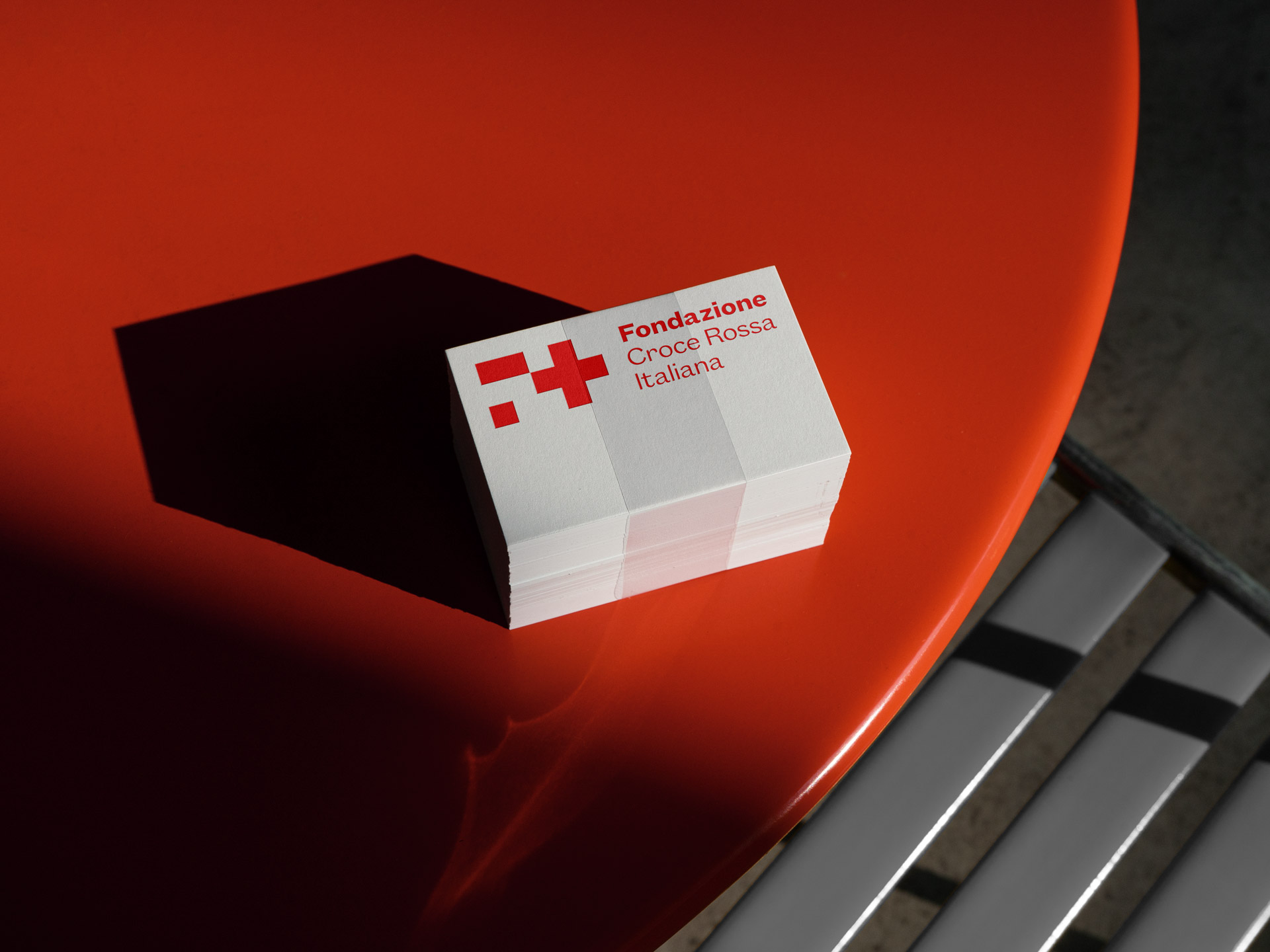
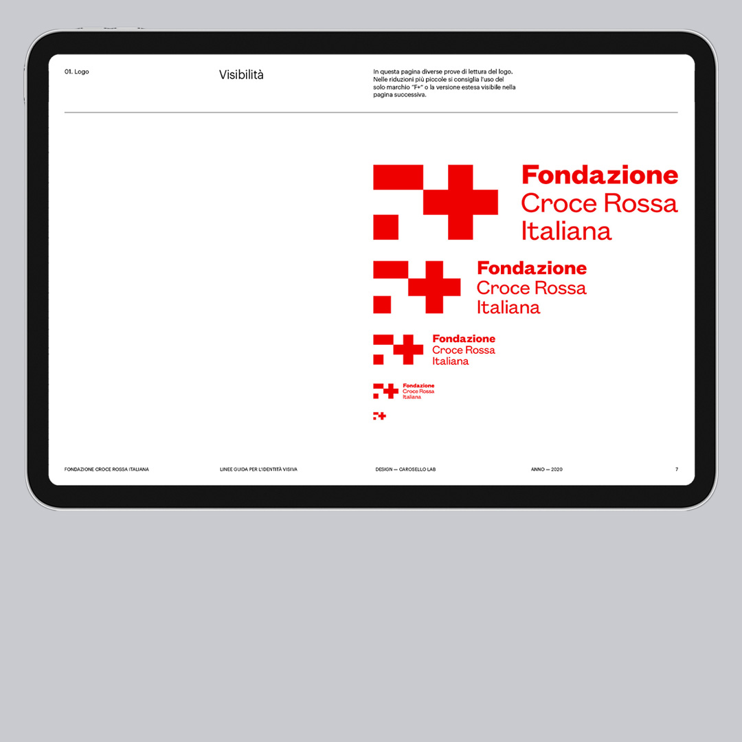
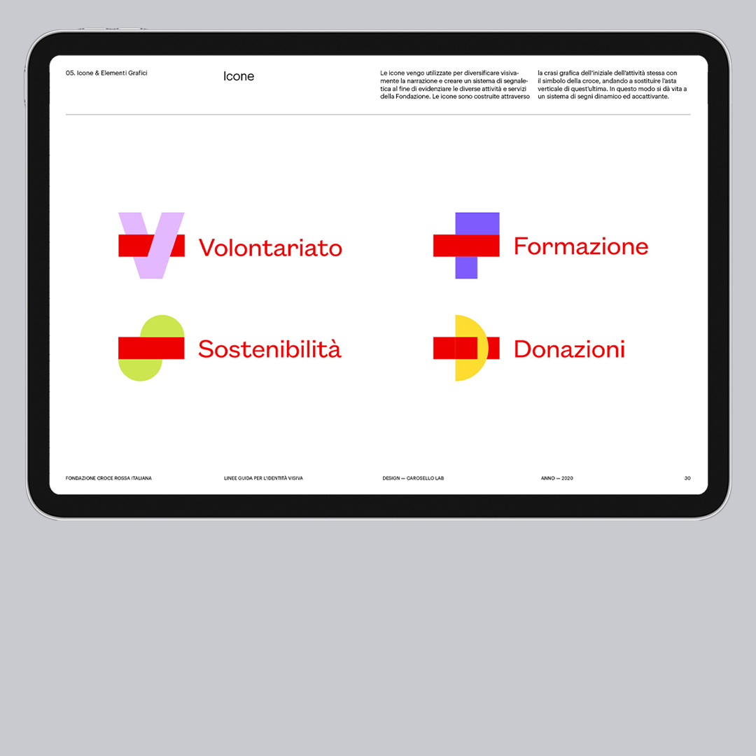
The idea was to create a squared module that could be the starting point for a visual and typographic system: so, we firstly designed the “F” for “Fondazione” built with this visual unit, to be combined with the existing Red Cross symbol, creating a new but coherent logo.

The different outputs of this design process are regulated in the Brand Manual: logo and visual identity usage are explored on every kind of support, digital or physical, defining and explaining how this system becomes a suitable container for Red Cross’s messages and campaigns.

DRAG
brand manual
Part of our scope of work, the brand identity guidelines are a set of rules for the production of all the visual material of the Fondazione. Here the pages that regulates logo, color palette, typography and icons.

In addition to the 4 letters designed for the operational areas, the complete uppercase alphabet was developed, so as to make future implementations possible and consistent.

To diversify all the operative areas of Fondazione CRI, starting from the grid used to design the “F” letter, we developed a sign system based on four icons: each operative area, Formazione, Volontariato, Sostenibilità and Donazioni, is so identified and characterized by a colour and a letter.

The website design reflects the simplicity and clarity which characterizes the visual identity: the layouts are the result of a careful balance of visual elements and blank spaces, to keep everything intuitive and easily usable, but still institutional and strict.

More projects you shouldn't miss