In September 2022 we faced a last minute challenge: to help the startup Switch creating a new visual identity to be presented 30 days later, in a funding event. We immediately aimed for a sleek, hyper contemporary tech look: minimal, geometrical but rich in small details.
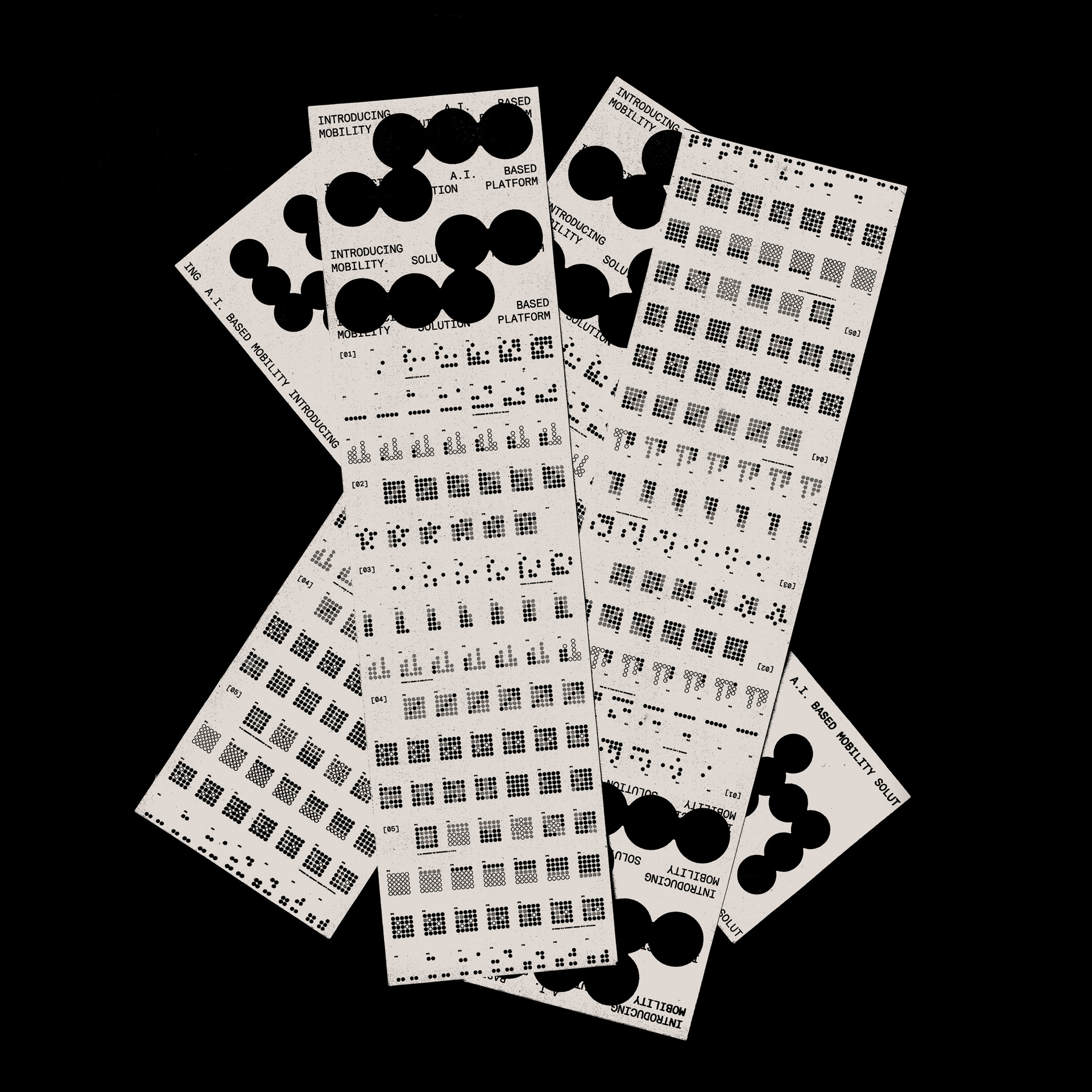
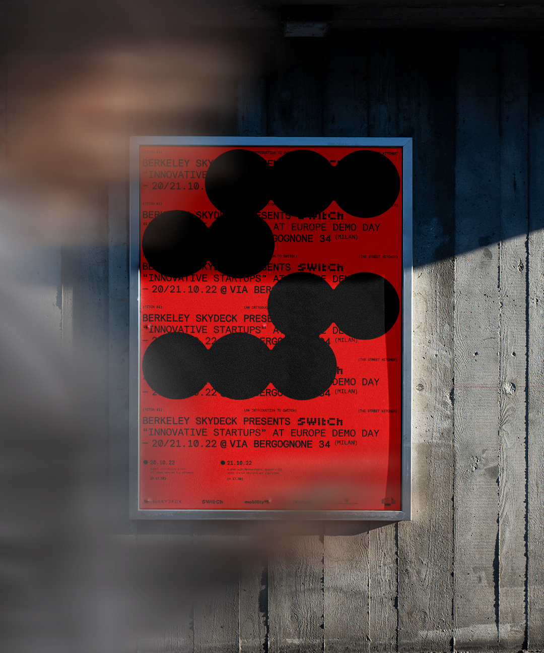
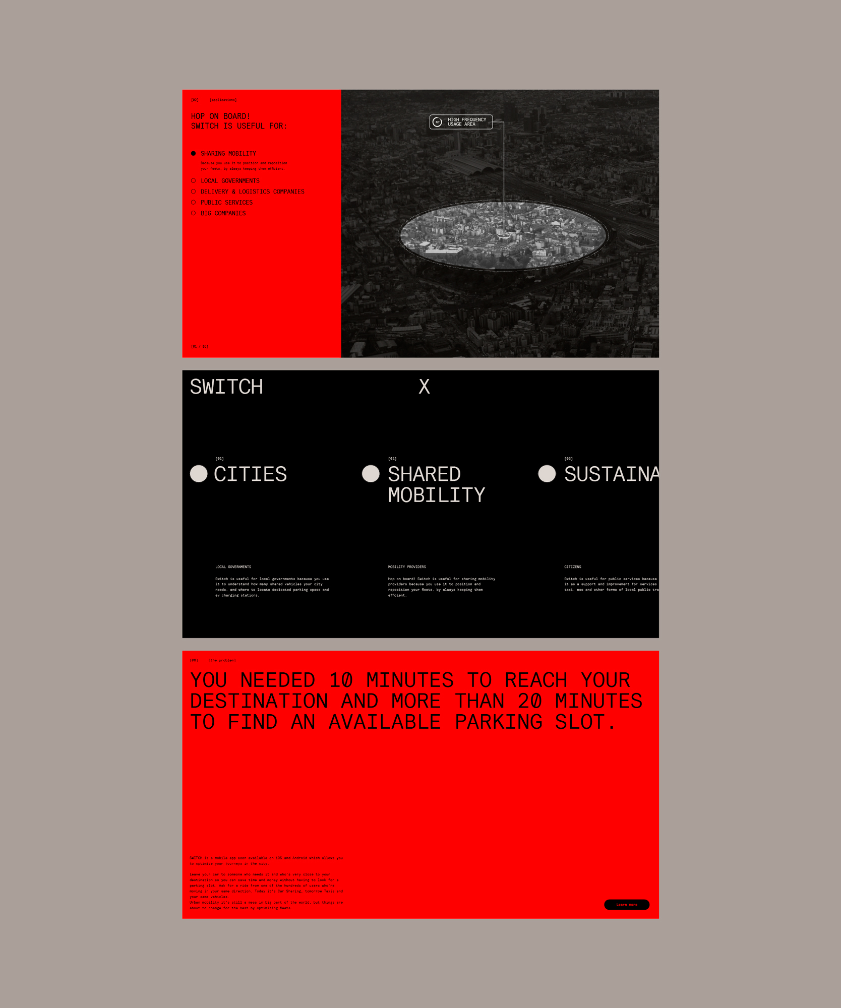
The logo takes inspiration from the circular areas that the company uses to delimit portions of the city, according to various and specific parameters. The use of circles is the recurring mantra of Switch’s brand identity, starting from the logo: a custom lettering drawn on a 4 units tall grid.
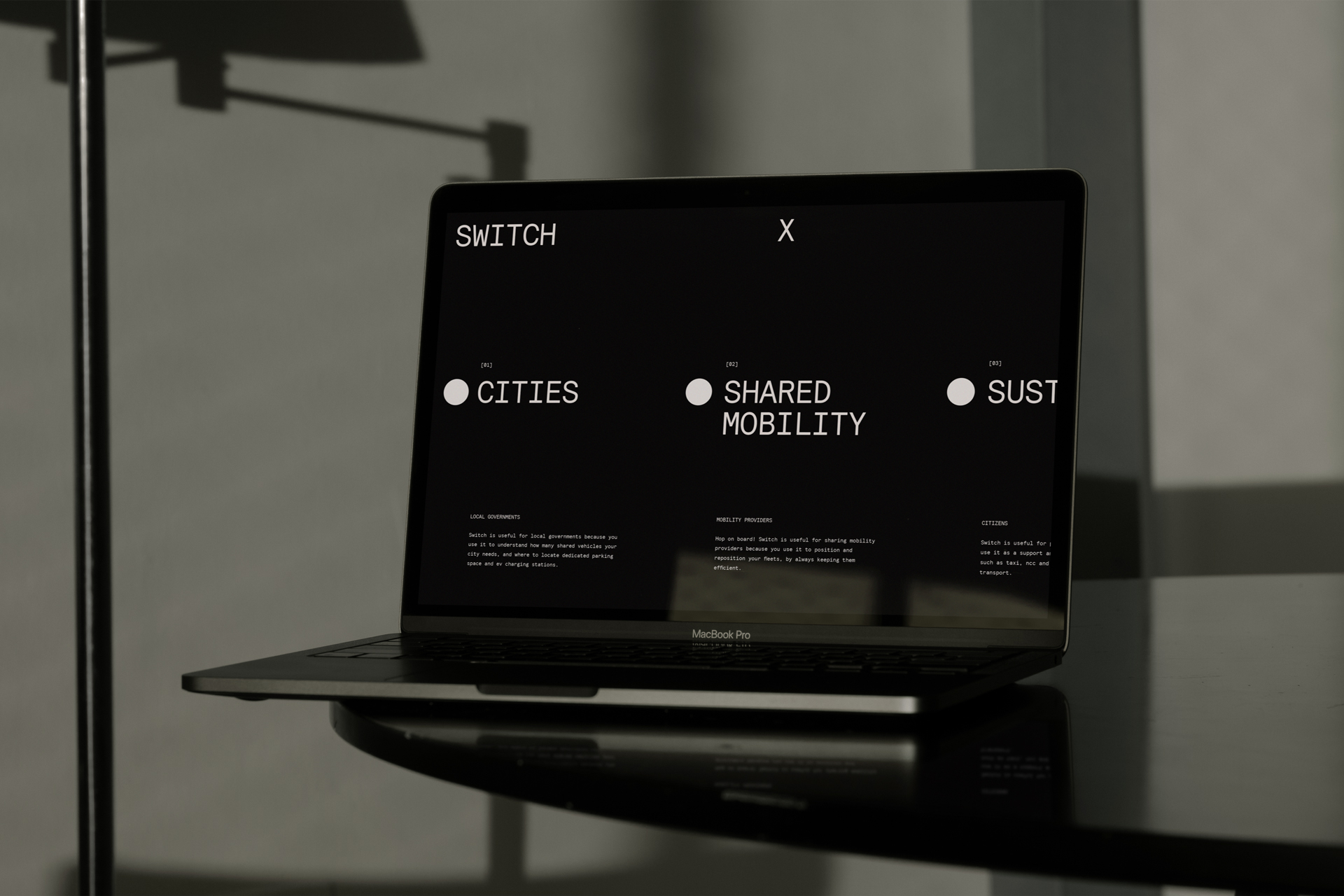
The website reflects the brand personality: a self-confident, accurate and young startup.
SWITCH
Visual identity and website design for Switch, the artificial intelligence platform that improves urban mobility through data.
logo, brand identity, web design
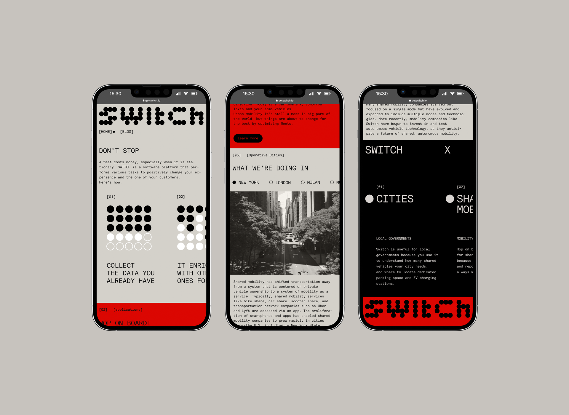
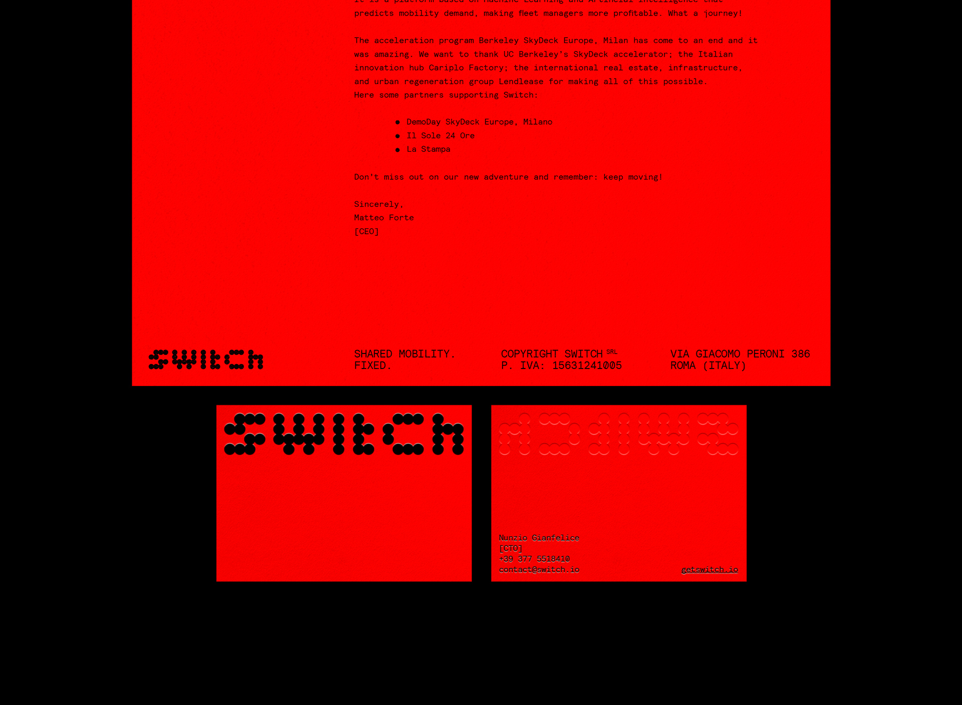
The fully responsive website represents a perfect synthesis of switch’s visual identity, made of monospaced technical typography combined with a vivid red and desaturated, monochromi-ish tints.
We immediately aimed for a sleek, hyper contemporary tech look: minimal, geometrical but rich in small details.
RICCARDO FUCCELLI, GRAPHIC DESIGNER
The website comes with a blog, designed to match Switch's developers necessities: the blog has a simple and orderly graphic layout characterized by a rigorous use of typography with almost no imagery.